A quick note on how this is related to friendship. I’ve been thinking of loneliness and discontent as triggers that induce people to contact existing friends and to try new strategies to make friends. The quality of loneliness/discontent and the intensity of the feeling can undermine these efforts if not understood/managed.
* * * * *
I started to think about radar graphs as a way to understand loneliness and discontent with current social situations. Here are a couple types of loneliness:
- Actual loneliness
- My social and emotional needs exceed my day-to-day interaction (long term), or today my social and emotional needs exceed the norm (acute).
- Bodily loneliness
- I may need to just be in the same space with people that I know. Sometimes I need other people to help me regulate my emotions just by being in the same room and chatting or playing a game.
- Relative loneliness
- I negatively compare myself to an “ideal” friend archetype or person I know, e.g., I want to be popular, or “Jan is always posting with her friends on social media”, or, I want to be in a friend group like they are on a TV show. This can also be a negative comparison of who you used to be previously.
- Induced loneliness
- I negatively compare my situation or surroundings to something I am exposed to, e.g., watching a scene of people being incredibly happy during a dinner party, social media posts, or getting nostalgic for old times.
- False loneliness
- I’m currently experiencing a negative emotion or body state and I think that achieving an ideal friendship situation will resolve it, e.g., if I suddenly get the urge to go out on Friday night at the end of a super stressful work week even though I am tired and grumpy.
For this post, I am going to focus on the first two bullets from the list above because these two are optimal for comparing my ideal state (where I function best) versus my actual state (how my life is right now). I’ll create another post for the others because those involve comparisons to external people, ideas, and events. But first, a quick digression to talk about radar graphs.
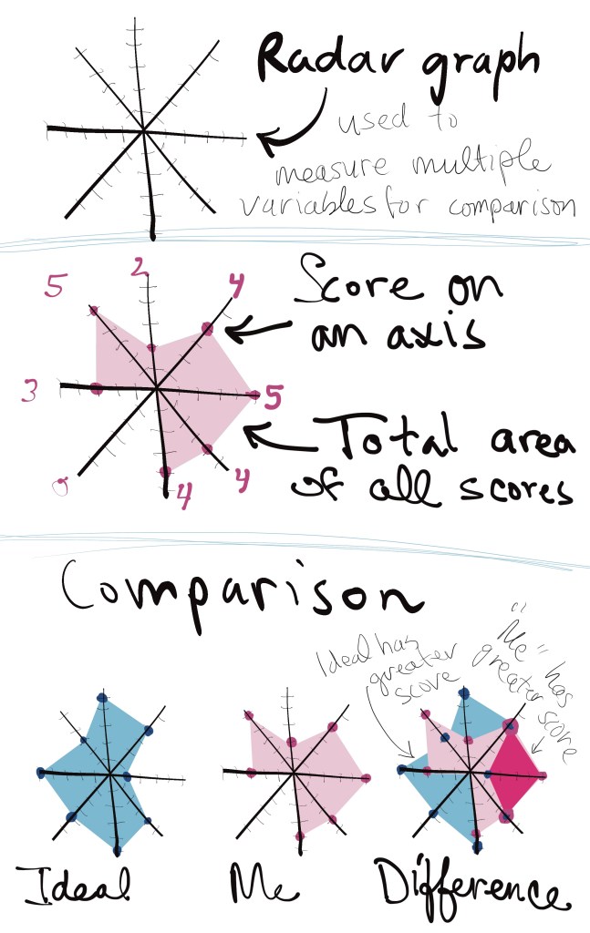
What are radar graphs?
I’m using radar graphs in the most simple version here, so I’ll just go very quickly through it for people who haven’t encountered them. Radar graphs consist of multiple spokes evenly spaced around a center point (like a clock). Each spoke measures something different and starts a ‘0″ in the center and has a score that radiates outward (1,2,3,4,5) so, the lowest score you can get on something is a ‘0’ — it doesn’t measure negatives.
When you have a score on each of the spokes, the scores are connected and filled in to make an filled in area that is the of the total of all your scores. On their own, radar graphs aren’t every useful, but when they are compared with other radar graph scores, then they become very interesting because sometimes your score will be greater or less than the compared score. And that’s where you can learn the most.
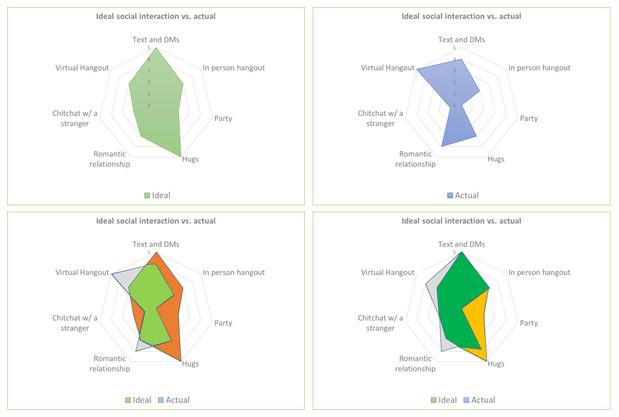
See the graphic below for the following:
- An example radar graph -used to measure multiple variables for comparison
- A radar graph with scores and filled in area
- A comparison between (1) ideal scores (2) my own scores (3) and overlay of ideal scores and my scores that show the difference between the two
Radar graphs to analyze loneliness markers
The first step in using radar graphs to using radar graphs is to identify the key elements to achieving social contentment for you. Each person’s will differ based on the type of interactions that most fulfill them. Some people may be more body-based and require hugs and physical closeness, other people may require debate or laughter or community building or a D&D game, etc. If there is something that usually isn’t a priority, but is continually on your mind, add that to the radar graph as well. That means your need is not getting met and it’s important.
Make sure to only include things that are behavior-based and measurable. For example, change “having fun” to “laugh with someone” – the laugh is measurable (and would definitely be on my radar graph).
Choose the top 6 or 8 to put on your spokes.
Choose a time measurement for your graph. If you are a very social person, you may make it weekly, if you are less social or have more personal responsibilities like dependent care, then maybe make it a month.
Choose a way to rank each spoke. It will be different based on what the activity is. If you need 5 hugs a week, make each mark = 2 hugs, which allows you to indicate when you have exceeded your quota (it seems silly with hugs, but it makes for an easy example). If you need one D&D game every week, make each mark = 1 game.
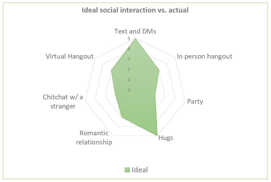
Create your ideal
Once you have your radar graph set up, mark out what you believe is your ideal number of each interaction and place it on the radar graph as shown in the example below and then fill in the area. Don’t worry too much about it as this can be tweaked later.
**The graphs in this post are just sample data, I’m going to have to take time to do this exercise myself and post later.
Description of the graph: Title: Ideal social interaction versus actual – only ideal scores shown. Scores in clockwise order from top (1) Text and DMs – 5, (2) In-person hangout – 3, (3) Party – 1, (4) Hugs – 5, (5) Romantic relationship – 3, (6) Chitchat with a stranger – 2, (7) Virtual hangout – 3.
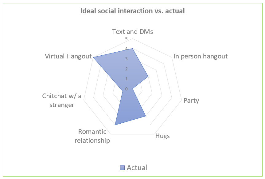
Create your actual
After you have your ideal mapped out. Take some time to measure your actual. You can try to think back to recent weeks/months and estimate what your actual scores are on these spokes.
Description of the graph: Title: Ideal social interaction versus actual – only actual scores shown. Scores in clockwise order from top (1) Text and DMs – 4, (2) In-person hangout – 2, (3) Party – 0, (4) Hugs – 3, (5) Romantic relationship – 4, (6) Chitchat with a stranger – 0, (7) Virtual hangout – 5.
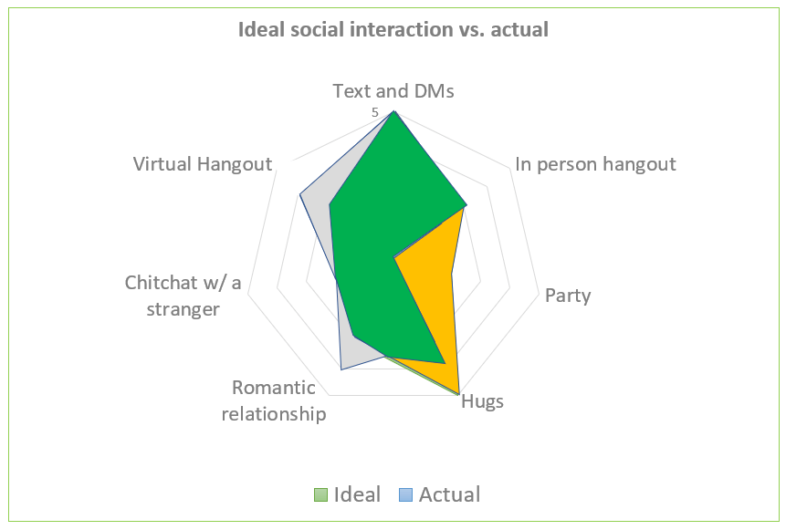
Compare your ideal vs. actual
Next you can overlay the two sets of data to see where they differ. In the graph below, the green is where the two scores overlap, the orange is where the ideal score is greater and the light blue is where the actual is greater. You can visually estimate the area and see that only ~40% of the filled in area is overlapping, which means this sample person may be feeling unfulfilled.
Description of the graph: Title: Ideal social interaction versus actual – both scores shown. Scores in clockwise order from top (ideal first, then actual):
- Text and DMs – 5 vs. 4
- In-person hangout – 3 vs. 2
- Party – 2 vs. 0
- Hugs – 5 vs. 3
- Romantic relationship – 3 vs. 4
- Chitchat with a stranger – 2 vs. 1
- Virtual hangout – 3 vs. 5

Tweak your behavior
If the person in the graph above is feeling unfulfilled, then they can tweak their behaviors to get closer to their ideal social interactions. In the graph above, where the actual exceeds the ideal, the person may be putting in extra effort into something without getting good returns for their effort, so they can scale back on that behavior. Things like online activity and group texts can easily exceed input vs. output.
Where the ideal exceeds the actual, the person can opt in to or schedule more activities that will fulfill this need. They can also prioritize not canceling these activities and scale back on others when possible.
The graph below shows what small tweaks can be made to create a much greater overlap. In this, they have increased text and DMs slightly, added one in-person hangout, asked for a hug, had two small interactions with a stranger, and opted out of one of five virtual hangouts. The results are much more in line with their ideal situation.
Description of the graph: Title: Ideal social interaction versus actual with behavior tweaked to optimize interactions – both scores shown. Scores in clockwise order from top (ideal first, then actual):
- Text and DMs – 5 vs. 5
- In-person hangout – 3 vs. 3
- Party – 2 vs. 0
- Hugs – 5 vs. 4
- Romantic relationship – 3 vs. 4
- Chitchat with a stranger – 2 vs. 2
- Virtual hangout – 3 vs. 4
If you would like to see all the graphs on a single image, I have provided them here in the order shown.
Conclusion
If this resonated with you and you enjoy experiments on yourself (which I really enjoy) then start passively viewing your behavior through this lens over time to see how accurate the scores are and how it shifts over time. Some scores you may be able to increase/decrease pretty easily, others you may have less control over, such as people who really want to attend parties.
I recommend checking out the part 2 of this post for more fun with radar graphs and loneliness.
