Here is a new concept for the next few posts: the experience map.
Ta da!
Most of the time people think about events in the binary:
Did you have fun? Yes or No
But, most experiences go more like this:
Some parts are good and some parts are bad. And whether or not you had fun depends on which parts you focus on.
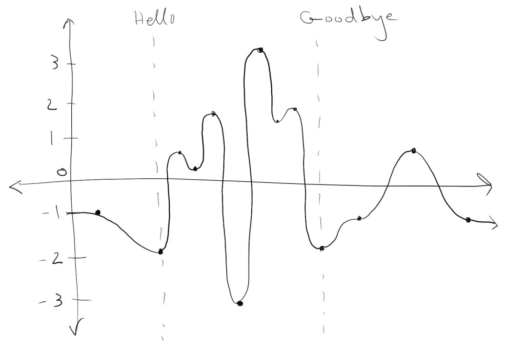
The horizontal axis is set up as the timeline of the event.
The vertical axis can be used to denote many things based on your personal experience. Is it simply a fun/not-fun range? Is it not-stressful (higher number) / stressful (lower number)?
For me, I think this diagram could be used in a variety of ways based on what I was thinking about at the moment. For example, if I was just trying to get out of the house more, then the axis would likely indicate stress levels. If I wanted to deepen my friendship with a person/group, this axis may denote when I felt “authentic” or “able to freely express myself” and when I wasn’t. It can be used however you want it to be.
I’ve marked “hello” and “goodbye” as the start and the end of doing something social, because the total experience of a social interaction includes both how you feel beforehand and how you feel afterwards. These bumper before/after feelings may be invisible to you if you don’t explicitly examine them, but can also sway your feelings about socializing and influence your memory recall.
More in the next post!
